 Charting ToolCharting Tool
The Charting Tool allows the user to display data in various chart types.
Select Chart Type from the dropdown menu.
Select the fields to Chart. This grid will populate based on the chart type chosen. The Preview on the right will change the display based on your selections.
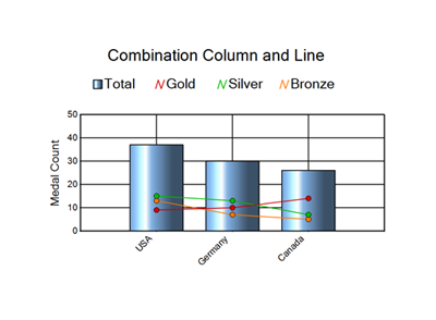
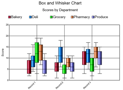
Series: A series is an element of the chart. Depending on the chart type, multiple series are supported. Each Series will have its own control for display. The Combination chart example below is displaying a chart with 4 series. One series is the column and the other 3 series are lines. The Box and Whisker example chart has 5 series. They are the individual color bars representing the departments: Bakery, Deli, Grocery, Pharmacy and Produce.
Label Field: The Label field refers to what will be displayed for each record you are charting. For most chart types this will appear on the horizontal axis as demonstrated in the 2 examples above. Bar and Tornado charts will display the record label on the vertical axis.
Setup Chart Appearance: Select the panel on the left to expose individual settings for chart display. The preview will reflect the selections chosen.
General: This panel controls the basic chart appearance.
3D Interior: Yes or No, will add the appearance of a third dimension to the chart.
Width: Horizontal dimension of the chart in the user's local settings.
If Default Distance Units is set to kilometers, this field is calculated in millimeters. See User Settings.
Height: Vertical dimension of the chart in the user's local settings.
If Default Distance Units is set to kilometers, this field is calculated in millimeters. See User Settings.
Resolution: Specify the image resolution.
Title: Specify a title for the top of the chart.
Title Size: Specify the font size for the Title text.
Subtitle: Specify a subtitle to nest under the title for the top of the chart.
Subtitle Size: Specify the font Size for the Subtitle text.
Primary Font: Sets the font for entire chart including the title, subtitle, x and y-axis labels. The primary fonts can be overwritten for the different chart elements from the Font Details panel.
Font Details: Separate font controls for different areas of the chart. These settings are only necessary if the user desires different fonts than what is specified in the Primary font setting on the General Panel.
Borders, Backgrounds: Controls for the appearance of borders and background colors.
Grouping: Controls how many charts are rendered for the incoming data. By default, Grouping is turned off and a single chart will be created as a summary of the incoming data. When a Grouping field is specified, a chart will be created for each group of records.
Specify the Field or fields for grouping. The All and Clear buttons assist with multiple selections.
Legend, Data Layout: Controls specific to the chart legend and how the tool plots the incoming data.
Show Chart Legend: Yes or No. Selecting Yes will display a legend. Selecting No will not display a legend.
As Separate Image: The legend is handled as a separate reporting Snippet from the chart. If Separate Field is chosen the Layout tool must be used prior to rendering
Position: Choices are Top, Middle, or Bottom. Middle position is only respected when the Alignment is left or right.
Alignment: Choices are Left, Right or Center.
Border Legend: Yes or No. Selecting Yes will draw a border around the contents of the Legend.
Width: Width of the border in pixels.
Color: Color of the border.
Plot Data: Incoming data can be plotted by Record or by Field. See Plot Data Options for more information.
By Record: The chart is plotted at the record level. A chart element is drawn for each record coming into the tool.
By Field: The chart is plotted at the field level. A chart element is drawn for each field. This option is only available for chart types that use one "Y" value. When this option is chosen, the following options are available:
Label Data Points: Yes or No. When Yes is selected, the data value will be displayed on the chart beside the element (bar, column, point, etc.) representing the value. When set to Yes, the following options are available:
Font Control: Specify the font, size and color of the label text.
Text Offset: Specify how many points to offset the label from the chart element.
Color Palette: Specify the color palette to use for the individual chart elements.
Vertical Axis: Control for the Vertical or Y Axis display. Users can control the fonts, place a title on the axis, and turn grid lines off/on.
Custom Origin: When set to Yes, the user can specify a baseline value so that records will be displayed in an Up/Down fashion, indicating if their value is above or below the custom origin.
Manual Increment: When set to Yes, the user can determine how many lines appear along the axis by specifying a value to increment by.
Manual Minimum: The user can determine what value to start the chart values with by specifying that value. This feature is available on the vertical axis for charts that have a vertical axis. It is found on the Horizontal Axis for Bar charts, and both axes for Scatter and Bubble charts.
Manual Maximum: The user can determine what value to display as the maximum when plotting the chart values by specifying the maximum value. This feature is available on the vertical axis for charts that have a vertical axis. It is found on the Horizontal Axis for Bar charts, and both axes for Scatter and Bubble charts.
Use Highlight Line: The user can choose to add a line to the chart to draw attention to a specific value along the vertical axis. The user can also specify the color of this line.
Custom Decimal places: When set to Yes, the user can specify the number of decimal places to display on the axis. This is useful for charting small values.
Right Vertical Axis: Control for the right Vertical or Z Axis display. Users can control the fonts, place a title on the axis, and turn grid lines off/on.
Custom Origin: When set to Yes, the user can specify a baseline value so that records will be displayed in an Up/Down fashion, indicating if their value is above or below the custom origin.
Manual Increment: When set to Yes, the user can determine how many lines appear along the axis by specifying a value to increment by.
Manual Minimum: The user can determine what value to start the chart values with by specifying that value. This feature is available on the vertical axis for charts that have a vertical axis. It is found on the Horizontal Axis for Bar charts, and both axes for Scatter and Bubble charts.
Manual Maximum: The user can determine what value to display as the maximum when plotting the chart values by specifying the maximum value. This feature is available on the vertical axis for charts that have a vertical axis. It is found on the Horizontal Axis for Bar charts, and both axes for Scatter and Bubble charts.
Use Highlight Line: The user can choose to add a line to the chart to draw attention to a specific value along the vertical axis. The user can also specify the color of this line.
Custom Decimal places: When set to Yes, the user can specify the number of decimal places to display on the axis. This is useful for charting small values.
Horizontal Axis: Control for the Horizontal or X Axis display. Users can control the fonts, place a title on the axis, and turn grid lines off/on.
Containing Axis: Control for the Containing Axis of a Radar Chart.
Series Style: Control for the display of the individual series elements of the chart.
Style Mode: Specify how you want to style each series in the chart. Choices depend on Chart Type chosen and include Standard and Formula.
Standard: Series styles depend on Chart Type chosen and are set by configuring the style attributes below.
Label Data Points: Yes or No. When Yes is selected, the data value will be displayed on the chart beside the element (bar, column, point, etc.) representing the value. The Label Data Points attribute works in Formula mode as it will be set to the selected Formula. This is useful if you only want to label the data points that meet a specified criteria.
Series Color: Color picker to determine the color that will be displayed on the chart for the series. This color will also apply in Formula mode to the selected Formula above. Each Formula can have its own Color attribute within the Series.
Series Line Width: Weight of a line in a chart in pixels.
Show Dots in Line: Controls whether or not dots (data records) will appear on the line.
Dot Size: Controls how big the dots will display on the chart.
Formula: Series styles are applied by setting up Formulas that pertain to the data inside the chart.
When the Style Mode is set to Formula, a grid appears with "Default" as the first value. This will be set to the same styling as the series would normally use. This entry cannot be removed from the list, but the styling can be changed. Should points in the chart not match any formulas you create, those points will get the styling of this "Default" item.
Click the  button
to add a formula. You can either type the formula
in the box, or click Edit to display the Formula Editor. See Expression Editor.
button
to add a formula. You can either type the formula
in the box, or click Edit to display the Formula Editor. See Expression Editor.
Click the  button
to delete the selected formula.
button
to delete the selected formula.
The up down arrows are used to reorder the formulas. Order is important, as formulas are applied in the order they appear in the grid. See Charting tool Formulas for more info.
With the formula selected, configure the other Series Style parameters (Label Data Points and Series Color) to set the style on the chart elements that meet the formula criteria.
From the Formula grid, the Legend field will automatically populate with the specified formula. You can edit this text to display on the legend.
Watermark: Control for the display of a watermark on the chart.
Use a Watermark: Select from None, Text or Image.
Text: Specify the text to display along with font, size and color of the text.
Image: Browse to the directory for the desired watermark image to use.
Opacity: Specify the Opacity for the watermark using a value from 0 (invisible) to 100 (opaque).
Opacity setting only controls Watermark Text. Transparent images will display, but the transparency must be set when creating the image. There is no control for it from the tool's configuration.
Because this tool includes an expression editor, an additional input anchor displays when the tool is used in an app or macro workflow. Use the Interface tools to connect to a Question anchor. See Interface Tools.
©2018 Alteryx, Inc., all rights reserved. Allocate®, Alteryx®, Guzzler®, and Solocast® are registered trademarks of Alteryx, Inc.