Design Workflow Tools
Note
App Builder is a new and evolving product available with the Alteryx Analytics Cloud Platform. Functionality is subject to change without notice as we continue to refine and enhance your experience. We appreciate your understanding and welcome your feedback on Alteryx Community as we continue to improve App Builder!
Learn about the various Workflow Tools available in App Builder.
Workflow Tools Palette
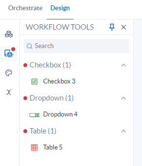
All of the tools you added to your app data flow in the Orchestrate panel can be found in the Workflow Tools palette in the Design tab. The number next to the tool name shows how many of each tool exist. You can expand and collapse the tool sections using the arrow next to the tool name.
Tip
When there are tools that were added to the Orchestration of an app that are available to use in the Workflow Tools palette, a notification indicator appears on the Workflow Tools icon and next to the available tool categories. When all tools have been added to the Design canvas, the notification indicator disappears.
Add and Remove Tools
To add a tool to the canvas, drag and drop the tool from the Workflow Tools palette onto the canvas. To remove a tool, select the trash icon.
Interactive Tools
Checkbox
Use Checkbox to allow for user selections in your app.
Configure the Tool
In the tool configuration window, enter a Label. This is the text that appears next to the checkbox.
Select Save.
DateTime Input
Use DateTime Input to allow for users to select a datetime in your app.
Configure the Tool
In the tool configuration window, enter a Label. This is the text that will appear above the date picker.
Select the Type:
Normal: Shows the date in DD/MM/YYYY format.
Year Only: Shows only the year.
Year and Month: Shows the month and year.
Normal and Time: Shows the date in DD/MM/YYYY and the time.
Select Save.
Color Options
General
Text: Select the color for the text.
Fill: Select the fill color.
Label: Select the label color.
Icon: Select the color for the icon.
Calendar
Chevron: Select the chevron color.
Number: Select the number color.
Dropdown Arrow: Select the color for the dropdown arrow.
Background: Select the background color.
Revert Colors: Reset the colors to their default states chosen in Themes.
Download
Use Download to download your data as a CSV.
Configure the Tool
Enter the Text for what you want the button to say.
Select the Size for the button and text.
Select the Variant:
Text: Shows just the text you entered.
Outlined: The button is outlined.
Contained: The button is shaded.
Select the Color. For more information on the color choices and how to change your theme colors, see Themes in App Builder.
Select Save.
Color Options
Text: Specify the text color.
Fill: Specify the fill color.
Border: Specify the border color. Only available when the variant is Outlined.
Revert Colors: Reset the colors to their default states chosen in Themes.
Dropdown
Use Dropdown to provide a list of user selections in your app.
Configure the Tool
Enter a Label for the dropdown.
Enter the Placeholder Text and Assistive Text.
Select the Label Source.
Select the Value Source.
Select the Format.
Select the Placement of Menu Dropdown:
Bottom:
Top:
Select Save.
Color Options
Text: Specify the text color.
Fill: Specify the fill color.
Dropdown Arrow: Specify the color of the dropdown arrow.
Label: Specify the color of the label.
Revert Colors: Reset the colors to their default states chosen in Themes.
Radio
Use Radio to provide a list of user selections in your app.
Configure the Tool
Enter a Label for the radio buttons.
Select the Label Source.
Select the Value Source.
Select Save.
Color Options
Text: Specify the text color.
Radio Button: Specify the color for the radio button.
Label: Specify the color of the label.
Revert Colors: Reset the colors to their default states chosen in Themes.
Rating
Use Rating to allow a user to select a rating from 0 to 5 stars in your app.
Configure the Tool
Enter a Label.
Select Save.
Color Options
Fill: Specify the fill color.
Border: Specify the border color.
Label: Specify the color of the label.
Revert Colors: Reset the colors to their default states chosen in Themes.
Run
Use Run to continue running data through your app. Data execution is paused until you run it.
Configure the Tool
Enter the Text for what you want the button to say.
Select the Size for the button and text.
Select the Variant:
Text: Shows just the text you entered.
Outlined: The button is outlined.
Contained: The button is shaded.
Select the Color. For more information on the color choices and how to change your theme colors, see Themes in App Builder.
Select Save.
Color Options
Text: Specify the text color.
Fill: Specify the fill color.
Border: Specify the border color. Only available when the variant is Outlined.
Revert Colors: Reset the colors to their default states chosen in Themes.
Textfield
Use Textfield to add text throughout your app.
Configure the Tool
Enter a Label for the tool.
Select the Type:
Text: Users can add text.
Number: Users can enter a number.
Multiline: Users can add multiple lines of text.
Enter the Helper Text, which will display below the text box.
Select Save.
Color Options
General
Border: Specify the border color.
Text
Text Input: Specify the color for the text input.
Label: Specify the color for the label.
Helper Text: Specify the color of the helper text.
Revert Colors: Reset the colors to their default states chosen in Themes.
Display Tools
Area Chart
Use Area Chart to show changes in quantities over time.
Configure the Tool
Configure how the title and subtitle of the chart display:
Enter a Title.
Select the Title Size. There are 4 heading options to choose from.
Select the Horizontal Alignment:
Align Left: Align content with the left margin.
Center: Center content.
Align Right: Align content with the right margin.
Enter a Subtitle.
Select the Subtitle Size. There are 4 heading options to choose from.
Select the Horizontal Alignment.
Choose the colors for your chart in the Color section. For more information on the color choices and how to change your theme colors, see Themes in App Builder.
Select the data to display in the chart:
Select the X-Axis variable. Note that the x-axis can only plot numeric columns.
Select the Y-Axis variable. Note that the y-axis can only plot numeric columns.
Select a Series, if desired, which is an additional column to display more than one line in the chart.
Enter an X-Axis Label and a Y-Axis Label.
Invert Axes: Check this box to swap the position of the axes on the chart.
Show Tooltips: Check this box to display tooltips which show information about the data in the chart.
Sort Data by X-Axis: Check this box to sort the data by value.
Configure how the legend displays for your chart:
Show Legend: When checked, the legend is displayed on your chart.
Floating: When checked, the legend displays as a floating entity that can be moved.
Select the Vertical Alignment.
Select the Horizontal Alignment.
Bar Chart
Use Bar Chart to display data in a bar or column chart on the canvas.
Configure the Tool
Configure how the title and subtitle of the chart display:
Enter a Title.
Select the Title Size. There are 4 heading options to choose from.
Select the Horizontal Alignment:
Align Left: Align content with the left margin.
Center: Center content.
Align Right: Align content with the right margin.
Enter a Subtitle.
Select the Subtitle Size. There are 4 heading options to choose from.
Select the Horizontal Alignment.
Choose the colors for your chart in the Color section. For more information on the color choices and how to change your theme colors, see Themes in App Builder.
Select the data to display in the chart:
Select the X-Axis variable. Note that the x-axis can only plot numeric columns.
Select the Y-Axis variable. Note that the y-axis can only plot numeric columns.
Select a Series, if desired, which is an additional column to display more than one line in the chart.
Enter an X-Axis Label and a Y-Axis Label.
Invert Axes: Check this box to swap the position of the axes on the chart.
Show Tooltips: Check this box to display tooltips which show information about the data in the chart.
Sort Data by X-Axis: Check this box to sort the data by value.
Configure how the legend displays for your chart:
Show Legend: When checked, the legend is displayed on your chart.
Floating: When checked, the legend displays as a floating entity that can be moved.
Select the Vertical Alignment.
Select the Horizontal Alignment.
Line Chart
Use Line Chart to display data in a line or spline chart on the canvas.
Configure the Tool
Configure how the title and subtitle of the chart display:
Enter a Title.
Select the Title Size. There are 4 heading options to choose from.
Select the Horizontal Alignment:
Align Left: Align content with the left margin.
Center: Center content.
Align Right: Align content with the right margin.
Enter a Subtitle.
Select the Subtitle Size. There are 4 heading options to choose from.
Select the Horizontal Alignment.
Choose the colors for your chart in the Color section. For more information on the color choices and how to change your theme colors, see Themes in App Builder.
Select the data to display in the chart:
Select the X-Axis variable. Note that the x-axis can only plot numeric columns.
Select the Y-Axis variable. Note that the y-axis can only plot numeric columns.
Select a Series, if desired, which is an additional column to display more than one line in the chart.
Enter an X-Axis Label and a Y-Axis Label.
Invert Axes: Check this box to swap the position of the axes on the chart.
Show Tooltips: Check this box to display tooltips which show information about the data in the chart.
Sort Data by X-Axis: Check this box to sort the data by value.
Smooth Lines: Check this box to round the lines connecting the data.
Configure how the legend displays for your chart:
Show Legend: When checked, the legend is displayed on your chart.
Floating: When checked, the legend displays as a floating entity that can be moved.
Select the Vertical Alignment.
Select the Horizontal Alignment.
Scatterplot
Use Scatterplot to display values for 2 variables for a set of data.
Configure the Tool
Configure how the title and subtitle of the chart display:
Enter a Title.
Select the Title Size. There are 4 heading options to choose from.
Select the Horizontal Alignment:
Align Left: Align content with the left margin.
Center: Center content.
Align Right: Align content with the right margin.
Enter a Subtitle.
Select the Subtitle Size. There are 4 heading options to choose from.
Select the Horizontal Alignment.
Choose the colors for your chart in the Color section. For more information on the color choices and how to change your theme colors, see Themes in App Builder.
Select the data to display in the chart:
Select the X-Axis variable. Note that the x-axis can only plot numeric columns.
Select the Y-Axis variable. Note that the y-axis can only plot numeric columns.
Select a Series, if desired, which is an additional column to display more than one line in the chart.
Enter an X-Axis Label and a Y-Axis Label.
Invert Axes: Check this box to swap the position of the axes on the chart.
Show Tooltips: Check this box to display tooltips which show information about the data in the chart.
Configure how the legend displays for your chart:
Show Legend: When checked, the legend is displayed on your chart.
Floating: When checked, the legend displays as a floating entity that can be moved.
Select the Vertical Alignment.
Select the Horizontal Alignment.
Table Tool
Use Table to display data in a table format.
Configure the Tool
Enter a Label for the table.
Select the Columns to Include from the dropdown.
Select the number of Rows per page.
Select any Additional Features for your table:
Dense Mode: Condenses the table. Rows and columns will have less space between them.
Row Selection: Allows you to select one or more rows that are output from the Table tool. This causes data to flow from the Table tool output anchor which can be used in a downstream tool.
Sortable: Allows users to be able to sort the table.
Case Sensitive: Sort order is case sensitive.
Select Save.
Text Display
Use Text Display to display a single column of data in plain text format.
Configure the Tool
Select the Variant.
Select the Color.
Enter the Value Source. This is the name of the column that holds the text to be displayed.
Select the Horizontal Alignment.
Select Save.
Chart Color Options
These options are available to customize the colors of your charts:
General
Border: Specify a border color.
Background: Specify a background color.
Text
Title: Specify the color of the title text.
Subtitle: Specify the color of the subtitle text.
X-Axis Label: Specify the color for the x-axis label.
X-Axis: Specify the color for the x-axis.
Y-Axis Label: Specify the color for the y-axis label.
Y-Axis: Specify the color for the y-axis.
Legend: Specify the legend color.
Chart
Chart Series N: Specify the color for chart series where N is the individualnumber of the series.
Revert Colors: Reset the colors to their default states chosen in Themes.
Table Color Options
These options are available to customize the color of your tables:
General
Border: Specify the border color.
Checkbox: Specify the color of the checkbox.
Text
Title: Specify the color of the title text.
Column Header: Specify the color of the column header text.
Cell: Specify the color of the cell text.
Footer: Specify the color of the footer text.
Background
Title: Specify the color of the title background.
Column Header: Specify the color of the column header background.
Cell: Specify the color of the cell background.
Footer: Specify the color of the footer background.
Alt Row: Specify the color of alternating rows in the table.
Alt Column: Specify the color of alternating columns in the table.
Revert Colors: Reset the colors to their default states chosen in Themes.
Color
Select color options for certain Workflow Tools. For more information on the color choices and how to change your theme colors, see Themes in App Builder.
Spacing
Set custom spacing for your Display and Interactive workflow tools in App Builder. Enter the number of pixels to add a margin to the Top, Bottom, Left, and Right sides of your element.
Conditional Logic
Each tool in the Design tab can be configured to show only if a certain condition is met.
Select options for OnlyShow If:
Select a Variable.
Select an Operator.
Select a Value, which is the value stored by the variable until changed by a Set Variables tool.