Common Cause Analysis
Use Common Causes Analysis to gain a deep understanding of the factors that affect your most critical KPIs. Common Cause analysis looks at 2 metrics in your data and quickly gives insights into their relationship so you can understand if they move in the same direction and how strong the correlation is between them.
You'll discover...
How performance connects across the metrics over time.
How closely related are the 2 metrics (in other words, do they usually move together?)
The ratio of their relationship.
What underlying drivers have gone up or down for both metrics? Which ones have gone up in one metric but down in the other?
How to Use Common Cause Analysis
There are 3 ways to use Common Cause analysis: Explore Data Insights, a Preset Report from scratch, and a Preset Reports using the Correlation Analysis template.
Explore Data Insights
The first way is to use Explore Data Insights.
From the Auto Insights Home page, select Start Exploring from the Explore Data Insights card and then Select a measure.
Select a dataset and measure from the dropdown options. Once you select a dataset and measure from the lists, select Apply Changes.
For Common Cause analysis, you must select another measure for Auto Insights to compare with your first. To start, select Add new query.
Select another measure and then select Apply Changes.
Auto Insights shows you insights in seconds! The insights are broken up into stories (sections).
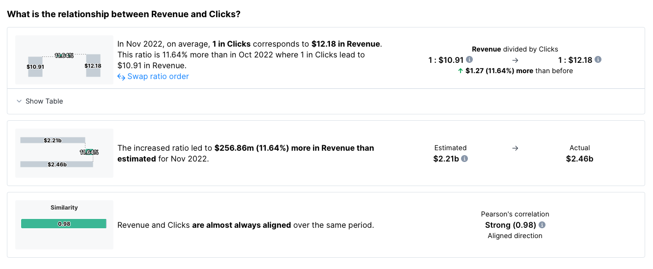
The first section shows you 3 stories that describe the relationship between your 2 measures—ratio, impact, and Pearson's correlation. Note: You might see less than 3. It depends on what Auto Insights can detect.
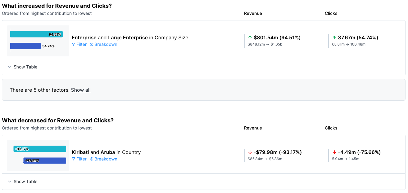
In the following sections, Auto Insights shows you the underlying drivers—what increased, what decreased, and what moved faster or slower.
Preset Reports
In the Preset Reports tab, there are 2 ways to run a Common Cause Analysis—create a new Preset Reports or use the Correlation Analysis template.
Create a New Preset Report
From the Auto Insights Home page, select Create New and then select Preset Report.
Select Create Blank Canvas option to build a Preset Report from scratch: select measures, counts, or averages.
Select Add the first page and then select 1 measure from your dataset.
From the page you just added, select Add new query.
Select another measure from the dropdown and then select Apply Changes.
Correlation Analysis Template
From the Auto Insights Home page, select Create New and then select Preset Report.
Select the Correlation Analysis template.
Confirm or select your datasets, and select your 2 measures. Then, select Create Custom Report. Auto Insights names your Preset Report with the date and time stamp. You can change it on the Summary page.
After you select Create Preset Report, Auto Insights takes you to the Preset Report Summary page to see your insights!
Learn more about editing your Preset Report on the Edit Missions page.
Run Common Cause Analysis Across Datasets
Common Cause analysis works across datasets. However, to generate insights it is important that...
The 2 datasets have at least 1 column in common (that is, identical values in the rows as well as an identical column name). The more common columns across the datasets the richer the insights.
OR
If there are columns that are the same across both datasets but have different names (for example, Zip Code and Postal Code) you have to manually add them as breakdowns to be analyzed as Auto Insights can't automatically detect that.
Permissions
Permissions work on a dataset level—users must have access to all datasets (max 2 datasets) used for the query to be able to view the Preset Reports page.
If a user doesn't have access to all datasets for that Preset Report page they can't view anything from that page. Instead, they see an error message that explains that they need dataset access to view the page. To send a request for dataset access, they can select the Request dataset access button.
Rename a Measure
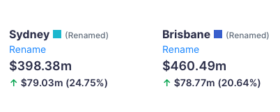
This feature is very helpful when you want to compare the same measure with filters applied. For example, a regional sales manager wants to compare store performance. They look at Sales (measure) filtered by Sydney versus Sales (measure) filtered by Brisbane. At first Auto Insights displays the results like this, and it's not easy to tell which region is which.
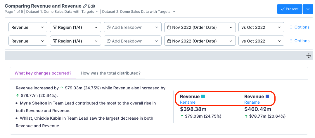
All you have to do is select Rename to enter a custom name and make it clear.
Known Limitations
Measures
Measures with different granularities don't work. For example, comparing a dataset based on yearly data with a dataset based on monthly data.
Renaming for a single measure analysis in Explore Data Insights and Preset Reports. It only works for Common Cause analysis and Correlation Analysis in Preset Reports.
Preset Reports
Goals don't work with Common Cause analysis, and therefore don't show on a Preset Reports page, summary page, or in the summary email.
Different time frames—the analysis works but it's not clear on the page which insights belong to which, and in the chart, it's not clear what you are looking at. On the page, you can rename the measures to address this, but the chart only shows 1 line.
Hiding and showing individual stories doesn’t work for Common Causes. It only works on single-measure pages with a breakdown.
Matching dates in the second query bar currently matches the settings, not the exact date. For example, if the setting in the first query bar is a rolling range offset by 2 months, then the second bar matches that setting, not the exact date (for example, the month of November) selected.
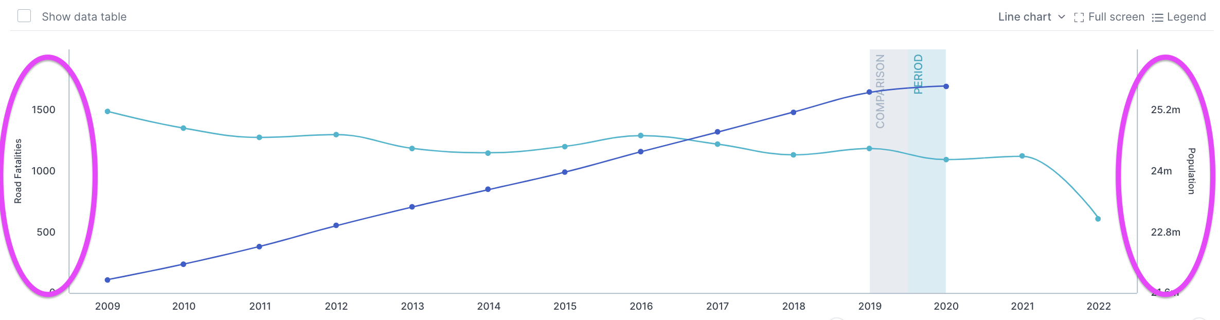
Intersections of lines in hero charts—most of the time the hero chart on a Common Cause page has different scales on each side which can be confusing. When you try to zoom into the intersection, it will likely move due to that.