Data Quality Bars
Just below the column name in the data grid is a horizontal band, which identifies data quality issues among the sample values in the column.
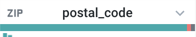
Figure: Data quality bars
Each color band identifies the relative number of records that fit the following data quality definitions:
Color | Type | Description |
|---|---|---|
Green | Valid | Valid value for the currently selected data type. |
Red | Mismatched | A value that does not match the listed data type. For example, if a column of Zip type contains, For more information, see Find Bad Data. |
Gray | Missing | Value is empty or null. For more information, see Manage Null Values. |
You can use a column's data quality bar to build a recipe step to address selected data. For example, click the red set of values in the data quality bar to generate a set of suggestion cards to address mismatched values in the column.
Tip
The histogram may also show you unwanted variation in your values. For example, if the column stores latitude data, the precision may be too fine (e.g. 37.764013 and 37.76022 versus 37.76). You can use the ROUND function to round your data to a more usable level of precision and thereby reduce the number of unique values in the column to a more manageable count.
For more information, see Supported Data Types.