Overview of Visual Profiling
In Dataprep by Trifacta, visual profiling provides real-time interactive visualizations of your dataset to assist in the discovery, cleansing, and transformation of your data. Visual representations are required for interpreting large volumes of data, and the platform's innovative profiling techniques visualize key statistical information in a dynamic, easy-to-consume format for faster transformation.
At the individual column level, visual profiles provide interactive statistical information visualized in an appropriate manner for the data type. For example, columns of Zip Code data type can be represented on a geographical map of the United States.
All visual profiles are interactive, so you can dig into the details of the data. Select one or more elements in a profile, and you can take immediate action on the data, either through steps you define or through transform recommendations provided by the platform.
The Transformer page displays a set of recommended actions to take based on the values, rows, or columns that you select in the data grid. These recommendations are motivated by platform logic and prior usage information. For more information, see Overview of Predictive Transformation.
Visual profiles are available while you transform your data in the Transformer page, when you dig into the detail of individual columns, and after you execute your job at scale. Each of these interfaces has different usage patterns designed to accelerate and simplify data transformation for that specific area of the process.
Uses
Locate anomalies. Visual profiling surfaces missing or invalid data in individual columns. These values can then be selected and transformed as needed.
Identify distributions. In the data grid, you can review value distribution for each column in your dataset. When exploring the column details, you can also identify and select statistical outliers among your column data.
Identify areas for further refinement. After a job has completed, you can review its visual profile through the application and then take action on problematic data.
Example
In the following example, a dataset containing address information has been loaded in the Transformer page:
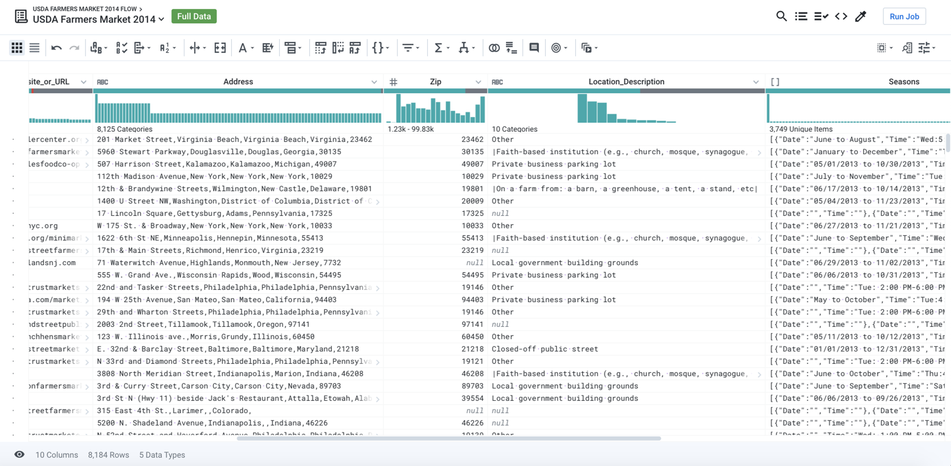
Figure: Example dataset
In this example, we are interested in exploring geographic information. From the column drop-down for the Zip column, you select Column Details.
Tip
Generate visual profiles from the column drop-down.
When you explore the column details of the new column, you can see the following representation of the data:
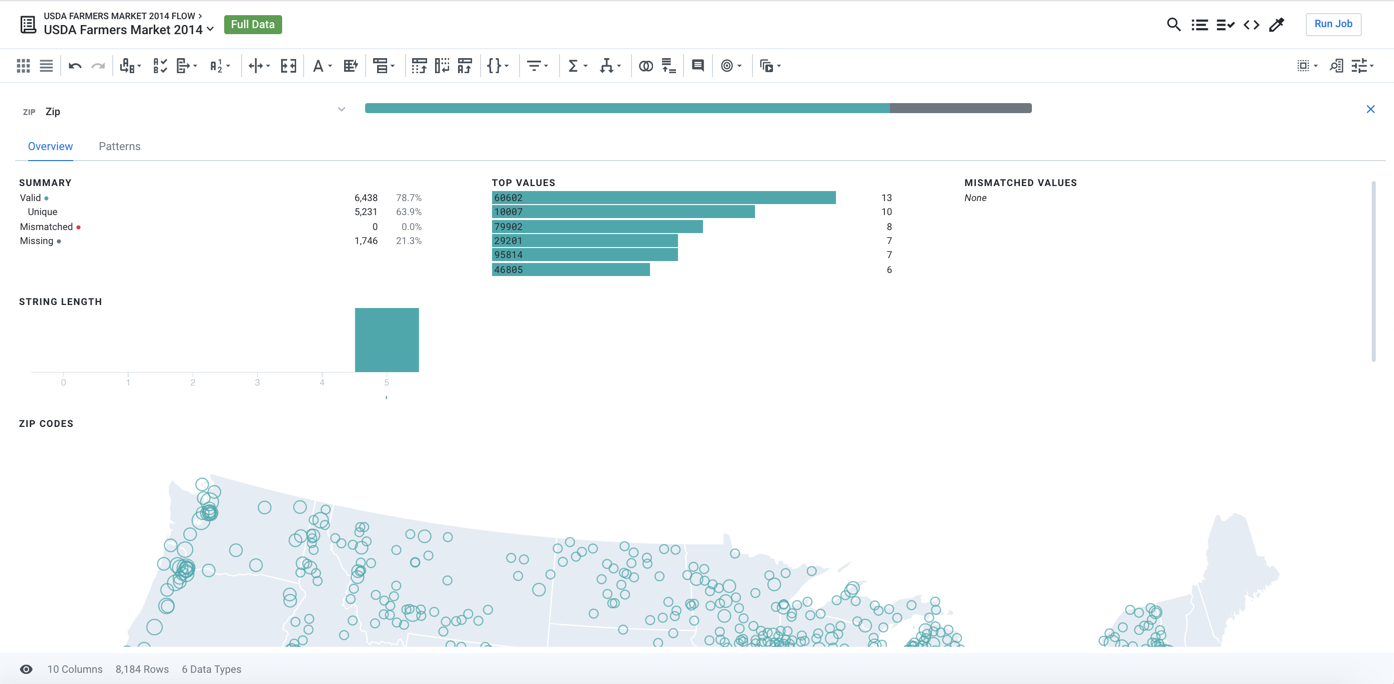
Figure: Zip Code data type represented as a U.S. map
In this case, the values in your Zip column are recognized as being of Zipcode data type. The application then represents these values as a U.S. map, which quickly renders numeric data into a format that's much easier to read and analyze.
Tip
The profile of the column values is represented in a type-specific visualization to assist in rapid analyzing and taking action on some or all values in the column.
Visual Profiling Interfaces
Wherever you can interact with data, visual profiling simplifies the process.
Tip
Each interface has been optimized for the scope of the data it is visualizing, whether the data is a single column, the entire sample of a dataset, or generated results.
Data Grid
In the Transformer page, the data grid is a tabular representation of a sample of your dataset. It is the primary interface through which you build your transformation recipes. Profiling tools:
Data Quality Bar: At the top of each column, you can see graphs counting the missing, invalid, and valid values for the column's current data type. Select one of the categories, and you can take immediate action on all of the category's values in the column.
Column Histogram: Individual values in the column are represented in a histogram at the top of the column. You can select one or more of these values, review relevant data, and take action.
See Data Grid Panel.
Whenever a transform is selected or specified, a preview of its effects is displayed in the data grid, including any changes to the data quality bar and column histogram of affected columns. See Transform Preview.
For additional details on visual transformation, see Transform Basics.
Column Details
Through the Transformer page, you can explore statistical details about individual columns, visually represented based on the column's data type. From the drop-down for any column, select Column Details.
In this interface, you can review the range of values in the column and can optionally select one or more values from other columns to see which values in the current column apply. The visualizations for a column depend on the data type.
See Column Details Panel.
Pattern Profiling
In the Column Details panel, you can review profiling of patterns detected in the values for the selected column. These patterns can be selected, which identifies the relevant values in the column that match the pattern. You can then use these selections as the basis for building transforms that apply to the matching values.
Job Details
After the application has successfully executed a job for which profiling is enabled, you can explore a visualization of the generated dataset in the Job Details page. You can download your visual profile and results of your data quality rules on the entire dataset in PDF and JSON format.
For more information on data quality rules, see Overview of Data Quality.
For more information on job details, see Job Details Page.
Enable
Visual profiling is enabled on a per-job basis. See Run Job Page.
Profiling Engine
Decoupled from the user interface, the profiling engine performs the calculations required to power the visualizations before job execution and after the job results have been generated.
In the Transformer page, the profile engine is called for incremental changes whenever a step is added to your recipe, so that you can see immediate updates to the visual profile for each column. It utilizes separate algorithms for generating the data quality bars, column histograms, value counts, frequency distributions, and other relevant statistics. When you dig into the column details, the visual profile is up-to-date and can be updated again based on your selections in that interface.
During job execution, it is queried as a separate job when profiling is executed across the entire dataset.
Note
When you choose to profile your results, you are creating two distinct tasks: 1) run your transform recipe against your source and 2) profile the results. Due to the computational complexity of generating the interactive results, a profiling task often takes longer to complete than a transformation task and is therefore an optional element of a job run.
Exact vs. Approximate Metrics in Visual Profiles
Dataflow
In Dataprep by Trifacta, profiling jobs are executed on Dataflow, in parallel with the transformation job.
Metric Type | Measurement |
|---|---|
Frequency (top-k) | Exact |
Numerical histograms | Exact |
Simple statistics (mean, stdev, min, max) | Exact |
Quartiles | Approximate |
BigQuery
For jobs executed in BigQuery, profiling jobs may also be executed in BigQuery.
Note
The option to pushdown profiling to BigQuery is selected for individual flows and is only applied if the job successfully executes on BigQuery. Additional limitations may apply. For more information, see Flow Optimization Settings Dialog.
Note
In BigQuery, calculations of quartiles uses a different algorithm than the same calculations in Dataflow. Some differences in values should be expected.
Metric Type | Measurement |
|---|---|
Frequency (top-k) | Approximate |
Numerical histograms | Approximate |
Simple statistics (mean, stdev, min, max) | Exact |
Quartiles | Approximate |
Profiling Files
Note
By default, files generated as part of visual profiling are hidden. You can optionally enable import from hidden folders. These file structures may change at any time and without notice.
When a job is run with profiling enabled, a set of JSON files is written to the following generalized directory:
gs://<user_output_directory>/jobrun/<jobId>/.profiler
Within the .profiler directory, you may find the following sub-directories:
Directory | Description |
|---|---|
profileTypeCheckHistograms.json | Contains one or more JSON files with metrics on valid, invalid, and missing values per column, based on the column's data type. |
profileValidValueHistograms.json | Contains one or more JSON files with metrics on the distribution of valid values per column. |
profilerRules.json | Contains one or more JSON files with metrics on the results of user-defined data quality rules. For more information, see Data Quality Rules Reference. |