Profiling Basics
Designer Cloud surfaces visual representations of your data for individual columns and the entire dataset and provides mechanisms for taking immediate action on issues in the data.
Profiling Source Data
When you first load your dataset into the application, you might want to run a job to profile your dataset before you build your recipe. The generated results and profile are accessible through the Job Details page in the Cloud Portal. This profile of your source can be useful later in seeing how your dataset has changed during development.
Profiling in the Application
When you identify something of interest in the Cloud Portal, you can select the visual representation of it, and the platform prompts you with a set of suggested transforms to add to your recipe. These visual profiles enable you to make quick assessments of problems, unusual patterns, and required changes to your data.
Note
Before your job is run, profiling information such as column statistics are exact counts of the sample that is currently loaded. After the job is run, profiled results in the Job Results page might include estimates for some metrics and counts, depending on the scale of the dataset.
Status Bar
The number of rows, columns, and data types in the current sample are displayed at the bottom of the page in the status bar.
Column Header
The top of each column contains a data quality bar, which identifies the valid, mismatched, and missing values in the column when compared against the specified data type, and column histogram, which identifies the range of values in the column.
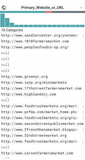
Figure: Example Column
Data Quality Bar - missing and mismatches values
Below the name of the column, the multi-colored band indicates the valid (green), mismatched (red), and missing (gray) values in the column, when matched against the column's data type. Click the missing or mismatched values in a column's data quality bar. You are prompted with suggestions of transformations to fix or remove these values.
Column Histogram
The bar chart at the top of each column in the Transformer page is called a histogram. Each column histogram displays the count of each detected value in the column (for string data) or the count of values within a numeric range (for number data). You can use this histogram to identify unusual values or outlier values, which can be corrected or removed.
Column Details - statistics and outliers
In the Column Details window, you can review key statistical information on the values in a column. Displayed statistics are based on the column's data type. Select Column Details from the drop-down for the specific column in the data grid.
Column Browser - profiles across columns
In the column browser, you can view visual histograms for each column in the dataset and make selections to identify correlations between values in multiple columns. To open the column browser, click the Columns icon in the Transformer bar.
Profiling in Job Results
When you run a job, you can choose to generate a visual profile based on the job results from the Run Job page.
Download visual profile
From the Profiles tab, you can download your job's visual profile to your desktop.