Column Histograms
The bar chart at the top of each column in the Transformer page, called a histogram, characterizes the data in that column. Each column histogram displays the count of each detected value in the column (for string data) or the count of values within a numeric range (for number data).
You can use this histogram to identify unusual values or outlier values, which should be removed or corrected.
Note
Counts in a column histogram reflect only the data in the sample in the data grid. Counts in the entire dataset may differ.
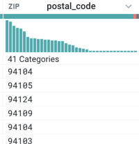
Figure: Column Histogram
Tip
When you resize the width of a column, the number of bars displayed in the column histogram changes accordingly. You can use this dynamic resizing to change the granularity displayed in histograms.
The contents of the column histogram vary depending on the data type for the column. For example:
For numerical types (Integer or Decimal type), each bar covers a range of values, and the bars are sorted in numerical order.
For a numeric range bar that overlaps values in another bar, values are inclusive on the lower bound and exclusive on the upper bound. For example, if a histogram bar represents the values 0-10, it includes the count of instances of 0 and does not include the count of instances of 10. The count of instances of 10 is part of the adjacent bar in the histogram.
The above applies only when there are overlapping values between data ranges. If there are no overlapping values, then the range includes the values of the lower and upper boundaries.
For non-numerical (i.e., “categorical”) types, each vertical bar covers a single value, ordered from most frequently-occurring values.
Tip
If you hover over a bar in the histogram, you can review specific values, the count of that value, and the percentage that value represents of the total count of values in the column.
When you select values:
For the values represented by the bar(s) you selected, rows containing them are highlighted, and suggestion cards are presented for handling those values.
Bars in other columns may partially change color. This feature, known as brushing and linking, illustrates the fraction of the bar values in other columns that correspond to your selected values. Brushing and linking is useful for identifying correlations in your data.
To select values:
Use
CTRL- click to select multiple discrete values.Click and drag across a range of values.