
The Charting tool includes formula support for setting styles for different chart elements. Use formulas to change the styles applied to specific points in a chart. This applies on a "per series" basis, and any number of formulas can be used per series, allowing you to modify most of the styles that can normally be applied to any given point in the series.
If you are using formulas to customize colors, go to Colors.
Because formulas are used to style different individual points within a chart, they do not apply to chart types that don't have individual points mapped in them (such as Area charts). They also do not apply to chart types in which their use could make the chart confusing (such as Pie charts) or very standardized (Pareto Charts). Here is a list of the chart types that can use formulas:
Bar
Stacked Bar
Column
Stacked Column
Tornado
Box and Whisker
Bubble
Scatter
Combination Column and Line chart, but only for the Column series.
Under Setup Chart Appearance, select the Series Style option.
Set the Style Mode to Formula.
A grid appears with the value Default. The styling matches the series styling default but you can edit it. Any points that do not match a formula's condition are styled to match the Default style. This is not true for Scatter and Bubble chart types.
Click the "+" button to add a formula. You can either type the formula in the box, or click Edit to display the Formula Editor.
Click the "-" button to delete a selected formula.
Reorder formulas with the up and down arrows. Formulas are applied in the order they appear in the grid.
With a formula selected, configure the other Series Style parameters to set the style on the chart elements.
From the Formula grid, the Legend field is automatically populated with the formula. You can edit the text that is displayed on the legend.
From the Formula Grid Control, there is a column marked Legend. The text in this column is what will be displayed on the Legend.
Set the Legend display from the Legend Panel. Show Legend has a Yes or No property.
By default, the Legend column is populated with the Formula, but you can edit it by clicking inside the field and typing the desired legend text.
If a formula is not applied to the points in the chart, then there will be no legend item for that formula. Likewise, if all of the points in the chart are styled by formulas, the Default element will not display on the chart or legend.
From the Variables tab on the formula editor, there are 2 additional fields that you can use in your formulas. They are...
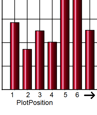
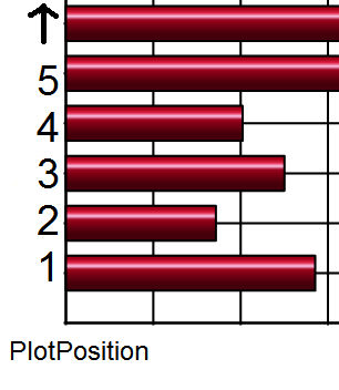
This variable represents the "row" for Bar or Tornado charts or the "column" for Column and Box and Whisker charts. They are applied "out" from the origin, as follows:
For Scatter and Bubble charts, PlotPosition can be used as a substitute for the X-axis (horizontal) field, similar to the CurrentField variable.
CurrentField can be used as a substitute for whatever field is selected for the series in question.
For the formula, you can use either [AMOUNT]>50000 or you can use [CurrentField]>50000.
Box and Whisker: Since there are actually 5 fields required per plot element on the chart, CurrentField obviously can't be applied to all the fields selected. If it is specified in this chart type, it applies to the "Median." The other four fields ("Maximum", "UpperQuartile", "LowerQuartile", and "Minimum") do not have substitutes for formulas.
Scatter and Bubble: CurrentField can be used as a substitute for the Y-axis (vertical) field. Therefore, for these two chart types, the combination of PlotPosition and CurrentField can be used as substitutes for both axes.
Scatter and Bubble charts behave differently than other chart types when a formula is applied to the series style.
When in Standard style mode, the points receive different colors based on a palette of colors available.
In the Formula mode, the default is only one color. Therefore, points on those charts that do not have other formulas applied to them don't cycle through different colors but instead are all the one color selected for the "default" entry. This keeps these chart types functioning in the same fashion as the other chart types that use formulas.